Continued...
I had a chance with another artist to develop a work to last six months
for this gap in-between buildings in Liverpool. Sponsored by a Furniture
Resource Centre who provide furniture for those in need, we picked up
on some graffiti on the back wall which said RAY + JULIE.
We devised
a story around two chairs - one for RAY and one for JULIE, relics from
the demolished building and we rippled some fresh concrete around them.
A simple work - commissioned as a six month piece, it still remains today;
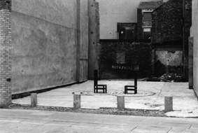 it was followed up in this artist-run space
with some works on canvas; shoe polish circles (which were someone else’s
paintings) and little balsa wood chairs playing out some other
RAY + JULIE scenarios. It was public art as a theme as well as an
approach. A few years ago, the original RAY + JULIE graffitti was
removed but last year a
it was followed up in this artist-run space
with some works on canvas; shoe polish circles (which were someone else’s
paintings) and little balsa wood chairs playing out some other
RAY + JULIE scenarios. It was public art as a theme as well as an
approach. A few years ago, the original RAY + JULIE graffitti was
removed but last year a

 theatre student tracked us down as she
wanted to use the two chairs in a performance. When hearing about
the work’s origins, she went out one morning and re-sprayed
the two names, sending us this video as proof.
theatre student tracked us down as she
wanted to use the two chairs in a performance. When hearing about
the work’s origins, she went out one morning and re-sprayed
the two names, sending us this video as proof.
Since leaving art school I’ve been self employed, no other income
beyond art, a big part of my time was spent on setting up and running
projects for and with young people. I like the energy involved. It was
never a case of doing this work to fund other pieces - they were works in
themselves and merited the same input as every other work.
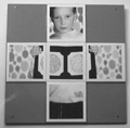 These pieces are an example of working to brief but still bringing part
of your own interest to the work. The brief was to work with thirty 7-10
year old school pupils in Leeds on "an artwork which encompassed
photography, ceramics, digital manipulation and the theme of health;
(this is not an unusual type of brief). David Harding, who ran the
Environmental Art course often spoke of "educating the client" and it was
only slowly, years later, that I began to learn to twist briefs around to
suit, to stimulate (if the artist is not interested, then you can’t expect
anyone else to be interested). We produced a set of forty panels, each
with five tiles with heat-sealed digitally manipulated versions of
the young people’s own photos, looking at eye-sight and colour deficiency
syndrome amongst other topics.
These pieces are an example of working to brief but still bringing part
of your own interest to the work. The brief was to work with thirty 7-10
year old school pupils in Leeds on "an artwork which encompassed
photography, ceramics, digital manipulation and the theme of health;
(this is not an unusual type of brief). David Harding, who ran the
Environmental Art course often spoke of "educating the client" and it was
only slowly, years later, that I began to learn to twist briefs around to
suit, to stimulate (if the artist is not interested, then you can’t expect
anyone else to be interested). We produced a set of forty panels, each
with five tiles with heat-sealed digitally manipulated versions of
the young people’s own photos, looking at eye-sight and colour deficiency
syndrome amongst other topics.
 This billboard was produced with 300 school pupils. The school set a
theme of railways. I said, OK, but no-one is allowed to depict trains
and we’ll only use two colours. One of the interesting things about
doing billboards in sections in studios smaller than the finished
artwork is the fact of not seeing the work until it is installed.
Each pupil painted one brick as part of a team, as opposed to judging
their creativity against each other (eg to run a ‘competition’).
This billboard was produced with 300 school pupils. The school set a
theme of railways. I said, OK, but no-one is allowed to depict trains
and we’ll only use two colours. One of the interesting things about
doing billboards in sections in studios smaller than the finished
artwork is the fact of not seeing the work until it is installed.
Each pupil painted one brick as part of a team, as opposed to judging
their creativity against each other (eg to run a ‘competition’).
 These young people were in their late teens, early twenties, on a drug
rehab programme. I worked with other professionals, always crucial, and
we created a relaxed environment. Buy the morning newspaper, drink some
tea, talk about the pictures, pick one, trace it onto acetate, project
up and draw round with thick black markers. A few weeks later they were
installed at local bus shelters. This is art as one element within a wider
lifestyle, but a useful element in that we still discussed standards,
quality and aftercare.
These young people were in their late teens, early twenties, on a drug
rehab programme. I worked with other professionals, always crucial, and
we created a relaxed environment. Buy the morning newspaper, drink some
tea, talk about the pictures, pick one, trace it onto acetate, project
up and draw round with thick black markers. A few weeks later they were
installed at local bus shelters. This is art as one element within a wider
lifestyle, but a useful element in that we still discussed standards,
quality and aftercare.
 One summer, myself and some musicians and an arts officer devised this
project; we toured a part of Liverpool in a van, stopping at parks and
street corners where young people hung out during the school holidays.
The musician started to jam and we produced 12 metal dustbins which were
filled with magazines and leaflets (sex and drug advice), so that
youngsters could read in a non-pressure situation. We then painted the
bins with topical issues and named it The Bin Issue, after the Big Issue
street magazine sold in the UK by those in vulnerable housing situations.
Great fun. The bin here has an image of a Liverpool footballer wearing a
protest t-shirt which led to another work.
One summer, myself and some musicians and an arts officer devised this
project; we toured a part of Liverpool in a van, stopping at parks and
street corners where young people hung out during the school holidays.
The musician started to jam and we produced 12 metal dustbins which were
filled with magazines and leaflets (sex and drug advice), so that
youngsters could read in a non-pressure situation. We then painted the
bins with topical issues and named it The Bin Issue, after the Big Issue
street magazine sold in the UK by those in vulnerable housing situations.
Great fun. The bin here has an image of a Liverpool footballer wearing a
protest t-shirt which led to another work.
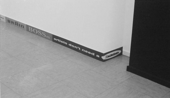
 This is an old hat factory in Cologne converted into studios and college;
I was doing a project in a nearby school and had the chance to show some
new work here. It was just after the World Cup in France where I’d look
at all the advertising hoardings during the boring matches and wondered
whether art would ever get to the stage of the grand prix or most sports
in terms of funders’ presence. In Liverpool when some Dockers went on
strike, there were t-shirts produced which from a distant looked like
CK but up close the CK were part of the ‘SUPPORT THE DOCKERS’ text
(the image on the bin). I was interested in this subverting of logos
and was again using ‘protest art’ or propaganda but taking it in a
different direction. The right hand logo revolves around a company
called LONDON BASE as the artist just to the right of this piece had
just left Liverpool for London at the time. Just out of picture to the
left are the 12 bins which I showed in the same space, trying to blur
the gap between projects.
This is an old hat factory in Cologne converted into studios and college;
I was doing a project in a nearby school and had the chance to show some
new work here. It was just after the World Cup in France where I’d look
at all the advertising hoardings during the boring matches and wondered
whether art would ever get to the stage of the grand prix or most sports
in terms of funders’ presence. In Liverpool when some Dockers went on
strike, there were t-shirts produced which from a distant looked like
CK but up close the CK were part of the ‘SUPPORT THE DOCKERS’ text
(the image on the bin). I was interested in this subverting of logos
and was again using ‘protest art’ or propaganda but taking it in a
different direction. The right hand logo revolves around a company
called LONDON BASE as the artist just to the right of this piece had
just left Liverpool for London at the time. Just out of picture to the
left are the 12 bins which I showed in the same space, trying to blur
the gap between projects.
 This is a detail from a billboard work which was about my love of vinyl
records and record shops, but my dislike for the type of music using the
format most at the moment - DJ’s and the dance scene. I bought 54 cheap
dance 12" and bolted them to the billboard and put the ACID smiley
face next to it. I never saw the work in real (it was sent over to
Belfast where it was installed) but apparently people did ‘browse it’
as you would in a record shop. Popular music has become a recurring
theme, and I had the chance to bring out this seven inch picture
disc, which I composed as a collection of samples of other artists
sampling other musicians - third generation sounds. The kind of iceberg
shape refers to David Sharnoff, the man who first heard
the Titanic’s SOS message and as a ‘reward’ he was given a job wherein
he allegedly patented the first picture disc record; and this is a small
home-made cassette from 1998, piecing together fragments of words from
Nirvana LPs so that Kurt Cobain sings about The Loch Ness Monster.
Again, I was trying to force connections between cultural events and
as we were just getting cheap access to the internet, I enjoy this
ability to hop between subjects, links and search engines which throw
up surprising connections.
This is a detail from a billboard work which was about my love of vinyl
records and record shops, but my dislike for the type of music using the
format most at the moment - DJ’s and the dance scene. I bought 54 cheap
dance 12" and bolted them to the billboard and put the ACID smiley
face next to it. I never saw the work in real (it was sent over to
Belfast where it was installed) but apparently people did ‘browse it’
as you would in a record shop. Popular music has become a recurring
theme, and I had the chance to bring out this seven inch picture
disc, which I composed as a collection of samples of other artists
sampling other musicians - third generation sounds. The kind of iceberg
shape refers to David Sharnoff, the man who first heard
the Titanic’s SOS message and as a ‘reward’ he was given a job wherein
he allegedly patented the first picture disc record; and this is a small
home-made cassette from 1998, piecing together fragments of words from
Nirvana LPs so that Kurt Cobain sings about The Loch Ness Monster.
Again, I was trying to force connections between cultural events and
as we were just getting cheap access to the internet, I enjoy this
ability to hop between subjects, links and search engines which throw
up surprising connections.
For the past four years I’ve been working on and off on a housing
estate called Raffles in the North of England. I worked with local
residents on developing some public art on the estate, trying to arrive
at a ‘look’ or unique identity for this place. Prior to starting in
Raffles I was sent this image of their Salvation Army Hall and asked
to propose an artwork for it. Therein lies one dilemma of community art,
of being asked to make decisions before consultation with locals, yet
without an interesting proposal, you don’t usually get an interview. What
I try to do is to come up with something that will engage people but
leave enough open doors for the work to change and be affected once
I’m actually based there.
I made this little cardboard model and came up with these figures -
anonymous heroes and heroines - caught in the act of carrying out new
work - painting, carrying, climbing. Despite not including many in this
talk, I find installation shots just as interesting as final shots.
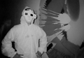
These are five standard shop mannequins dressed in waterproofs and bolted
onto a new community hall. They had steel armatures welded by a local man
and some young people and pensioners repainted a stained glass section.
The talks were of the original 1930’s stained glass (pensioners) and how
similar computer screen art is to stained glass (youngsters). The top text
says H-A-L rather than HALL because one of the mannequins is holding an L
plate (driver learners). She was christened Leslie and was stolen after
four months, hacksawed off, turned up at a party and was later found,
minus legs, in the river. She immediately became ingrained in local
folklore. There were four female figures and one male sitting doing nothing which kind of reflected the area.
With some other young people we made a little figure inside the hall,
kicking over paint, letting people decide whether it represents naughtiness
or an accident. The smaller figure was also an attempt to alter the
interior space, make it feel bigger, higher. The ‘miniquin’ is painting
a portrait of one of the bigger mannequins. It’s a simple pun on the fact
that the area had a ‘negative image’ and we were constantly trying to twist
anything negative into something positive (especially casual spoken cliches).
There were also discussions about letting young people use digital cameras
before they had done photography based around a negative.
One day we read about Damien Hirst selling some spin paintings for
five-figure sums, so we built a big spinning machine in and old warehouse
from scrap metal and bicycle parts, and some young people made their own.
Some are still on display in the city centre; it was a way of talking to
them about making art without being able to draw in a classical sense,
 of knowing when a work is finished and of making judgements and trying
to begin to explain the market system. We later repeated this to get some
of them into the local Gallery
which they took over for five days, with a DJ performing constantly,
a project called Doctors of Spin. And we arranged it for them to display
their small spins next to a Hirst original which was a fantastic moment.
From a warehouse to a gallery, echoing the shift in many artists’ careers.
of knowing when a work is finished and of making judgements and trying
to begin to explain the market system. We later repeated this to get some
of them into the local Gallery
which they took over for five days, with a DJ performing constantly,
a project called Doctors of Spin. And we arranged it for them to display
their small spins next to a Hirst original which was a fantastic moment.
From a warehouse to a gallery, echoing the shift in many artists’ careers.
After about three years, I wanted to collect together all the stuff
we’d done on Raffles, and ended up doing it in two ways - the first actual
and the second ‘virtual’. We wanted to develop a kind of Museum; no-one
could decide WHERE it would be so we designed and built a mobile one, in the shape
of one of the local houses. There was a large video screen in the
middle for locally-made documentaries and animations, a photo archive and
the structure opened out to reveal a domestic living room scene - one of the
little mannequins comes home after a days work to put their feet up, put
on a mask, maybe dream of being someone, surrounded by books and
objects.
Last year I also worked with a couple of residents who did have an art
background. The estate is currently being systematically pulled down,
demolished, people are being re-housed or moved away and, whatever the
rights and wrongs, there is a lack of information about what’s going on.
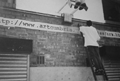
We did this billboard
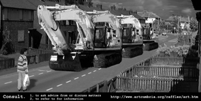 based on the Tiennamen Square photo, with some definitions of CONSULT.
Again, the juxtaposition is coincidental but the ‘I’ of River island also
serves as an ‘I’ for Information. At the bottom we also included the
address of a new website I set up to document all the Raffles projects - the ‘virtual’ record of all the
work. We spray painted the web address on the front of the building,
mixing hi-tech with do-it-yourself.
based on the Tiennamen Square photo, with some definitions of CONSULT.
Again, the juxtaposition is coincidental but the ‘I’ of River island also
serves as an ‘I’ for Information. At the bottom we also included the
address of a new website I set up to document all the Raffles projects - the ‘virtual’ record of all the
work. We spray painted the web address on the front of the building,
mixing hi-tech with do-it-yourself.
Last year I also organised a second concentrated billboard project,
this time with another artist to share some of the work. It took place
in Liverpool and was different from Glasgow in that we used various
locations and standard existing panels and also worked mostly with
established artists. I was curious to try this but looking back it was
not an experience I really enjoyed, having to go through galleries and
dealers and fit into the artists busy schedules. The project started
with an ‘apology’, by Pavel Buchler who had produced the NORTHERN HORIZON
piece at Bellgrove and was still intrigued by the Ross Sinclair saga of
HAT/HATE, that is billboard companies making errors when pasting. It was
also a word that NATO was issuing every day at the time re: Kosovo.
Liverpool artist Sue Leask worked with the same site; the pyramid is
constructed and it was interesting the way in which this work sucked up
the environment over the weeks, bird shit from above and dirt from the
street.
I did this sort of experimental work with the German artist Kirsten
Klockner. We’d decided to split the panel into 12 sections (which is how
each of these posters is produced and put up) and have a kind of
‘conversation’. We made some rules.
I e-mailed her the first image in the top left - the ear - and she had
to immediately amend it and e-mail it back. I would go with my first
response and so on. I then painted the finished design in gloss which
gave it a beautiful tightness and finish that is difficult to achieve
even with the most expensive print techniques. It’s about the most
unusual work to look at within the project and I’m still not sure how
successful it actually is, which is maybe not a bad thing.
Pierre Huyghe from Paris has a particular approach to billboards.
He will do a research trip to the location and photograph someone within
its vicinity. This image is then enlarged and returned to the same
billboard. For Liverpool he staged this scene with two passers by
just around the corner from the billboard. It was interesting to
accompany him, with his French accent, as he just walked up to two
strangers and asked them to pose, to kiss. We put the poster up for two
weeks, it was then replaced by a commercial poster before returning for
a further two weeks, to increase the strangeness and satisfaction of
seeing such a text-less undoctored local image.
At this time, Liverpool was staging its first Biennial of Contemporary
Art so the billboard project managed to raise some additional funds,
allowing us to pay artists’ visits, flights, printing costs and a fee.
With this extra money we were able to negotiate the rights to display
Felix Gonzales-Torres’ Untitled work from 1989. His New York gallery set
out some interesting criteria such as ‘the work must be set in a
picturesque location’ which questions the whole role of billboards’
placements. Elsewhere in Liverpool at the same time there was a
drink-drive billboard campaign which added something new to the work
(and I do think that people in the UK have become very critical and
aware of billboards and styles).
Fiona Banner’s work (on the right) listed every
English language pop song which begins with I LOVE YOU. Standing in
front of it you could conjure up various tunes in your head, as it
moved from left to right from the first - I LOVE YOU EASY - to the last -
I LOVE YOU - I’LL KILL YOU. The poster immediately to the left was an
insurance advert showing a woman holding a vase as if it were a child with
the slogan Protected, because of you. Just underneath this, and
above the logo, someone had taken some red spray paint and added
WHO TOUCHES THE KIDS IN THE WRONG WAY...
When reserving these billboards, there is never any discussion as to
which poster will be its neighbour but the context can definitely and
unexpectedly add to the work. For me this is the continuing appeal of
the format.
This is the third last piece I’ll show and this is a work from January
of this year. I left Liverpool and moved up to Newcastle in the North East
for a ten month residency in a school. I could set the brief as long as it
involved some digital element which I had been working with anyway. I was
talking to a young person about ‘3D computer games’ and I realised that I
still associated the term ‘3D’ with wearing special glasses. So, myself
and some of the pupils (15-16 yr old) found the website that explains how
to make your own 3D pictures and we’re developing a series of 3D images -
anaglyphs - on the computer and printing them up for billboard
installation, to be viewed with those red/blue glasses.
We were looking at the ‘School of Athens’ fresco of Raphael in terms of
compositions and references - theology, mathematics, astrology etc, but one
pupil was also obsessed by the Predator-type movies so we introduced some
ghost-like figures which appear after lengthy viewing. We also combined
four 3D images into this one piece to break up the surface and throw the
perspective. It was about creating a laboratory in the school where we
could try things and pupils could work as a team on work which would
not be formally ‘marked’ or ‘assessed’.
I always use back up material to help explain where we going and in
the school we had images like this Diesel advert
 and this billboard work from Markus Schinwald, trying to tell stories or
convey ideas without words.
and this billboard work from Markus Schinwald, trying to tell stories or
convey ideas without words.
The second billboard just went up 2 weeks ago and is a kind of
back-view of the first; the central figure relates to Gormley’s huge
Angel Of The North monument, the pupil on the right is holding a
sphericon, this beautiful new geometric shape that a 17yr old
discovered and the figure to the left improvised this pose which
I realised was like the Yoko One piece that attracted John Lennon - a
small word at the top of ladders. In our version the word says NO
rather than YES. I worked with a local free newspaper, encouraging
them to do an article to help explain or assist with some of the
references, and their distributor on the streets was giving out the
3D glasses to those wishing to view the work properly. Also, recently
I experienced a bus shelter poster for the Cartoon Network which ‘spoke’
every few minutes via a hidden speaker. It got strangers joking with each
other. Maybe it’s something to follow up.
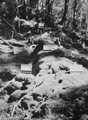 I’ll end with this work from last year. I was somehow invited to spend
some time in the country side, in Wales, as part of an International
Artists Workshop. Being a city kid, I made some little blank billboards
(15cm high) and sat in the forest for two weeks planting them. I thought
at some stage they would be ‘filled’ with images but they remained blank.
A little balsa wood city gradually grew around them and then at the end of
the fortnight I asked artist Suzann Victor to respond to the work. She proposed that she
destroy the work, with her own body. I agreed to this proposal.
I’ll end with this work from last year. I was somehow invited to spend
some time in the country side, in Wales, as part of an International
Artists Workshop. Being a city kid, I made some little blank billboards
(15cm high) and sat in the forest for two weeks planting them. I thought
at some stage they would be ‘filled’ with images but they remained blank.
A little balsa wood city gradually grew around them and then at the end of
the fortnight I asked artist Suzann Victor to respond to the work. She proposed that she
destroy the work, with her own body. I agreed to this proposal.
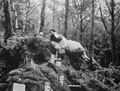 She blindfolded herself and tortuously rolled and tumbled down through the
city until everything had crumbled. All that remains, as with all the billboard works you’ve seen, are
a few slides.
She blindfolded herself and tortuously rolled and tumbled down through the
city until everything had crumbled. All that remains, as with all the billboard works you’ve seen, are
a few slides.